UX Design Case Study
What’s the Mission?
ClassFindr aims to streamline the process for students to find, compare, and register for courses that meet their academic needs across various accredited universities. Our team undertook the challenge to design ClassFindr, a platform that simplifies course discovery for students looking to take classes outside their primary institution. As the project manager of the team I undertook the responsibility of managing and assigning tasks, keeping a tight schedule, and making sure everything was clean and organized while also helping the the design and research of the final project.
Research Phase
To begin our research we knew we had narrow down our focus and decide what our goals would be leading us to the following questions that led our research:
Why do students take courses at other universities?
What are the challenges students face when transferring credits from external courses?
Secondary Research
We reviewed Student Information Systems (SIS) and evaluated competitor features preforming a competitive analysis you can see on the right. We also looked at comparators platforms like NerdWallet and Berkeley Time to gain domain insight.
User Interviews
We conducted 10 interviews with students aged 21-26 to understand their experiences. After sorting our interviews highlights in an Affinity Map, we found key pain points, such as limited course options at home institutions and difficulties with credit transfer processes.
QUOTE 1
“There was a time in college where I wanted to become a teacher but my college didn't offer teaching courses so I had to look elsewhere.”
QUOTE 2
“[I struggled with] not knowing what classes to take.”
QUOTE 2
“I knew it would have been way more work and then also I couldn’t tell if it’d fit with my schedule.”
After hearing the stories from our interviews we had a good sense of who we wanted to design for and created our persona, Betty.
Problem Statement
As a student pursuing graduation from a higher education, I need a better way to discover and plan courses that fit my needs (schedules, requirements, cost) beyond just at my home institution, because information regarding other options is not easily accessible.
Ideation and Prototyping
With our research insights and problem statement, we began designing the ClassFindr experience.
Feature Prioritization
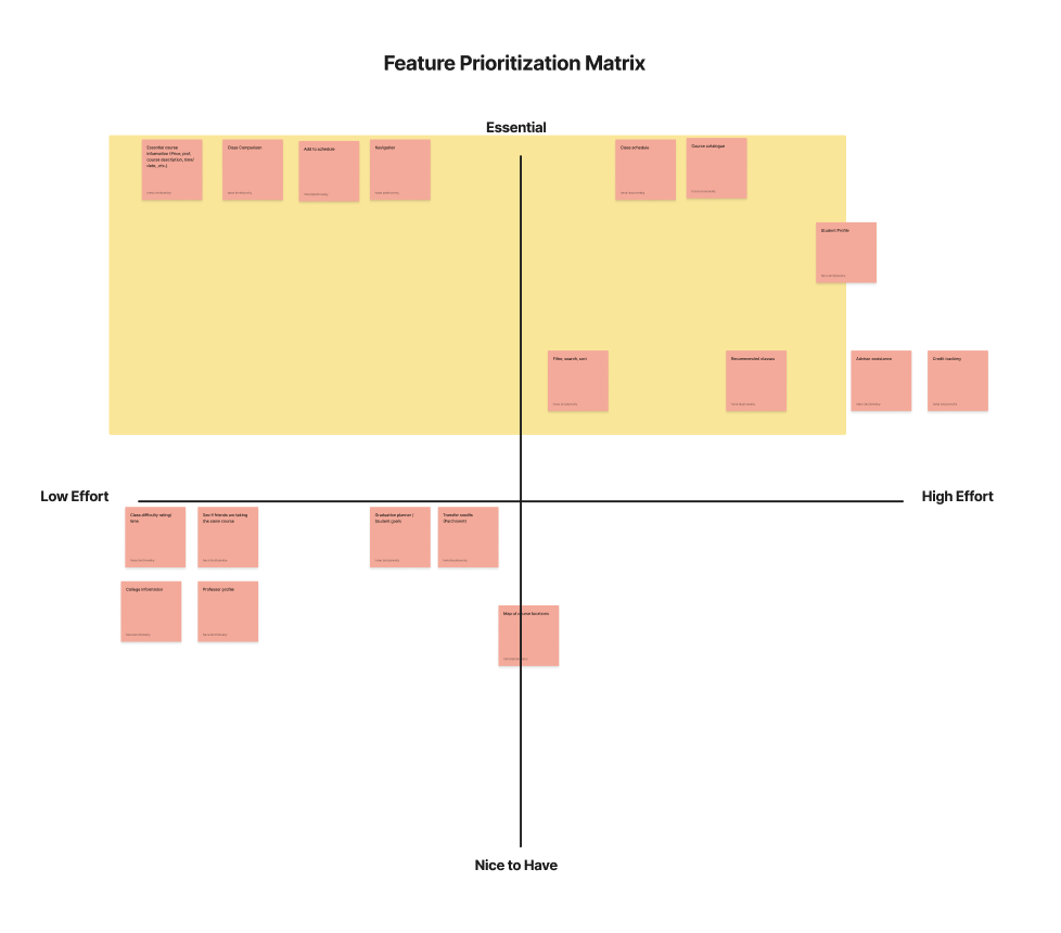
We prioritized features essential to ClassFindr’s MVP, including:
Course catalog with filtering options
Class comparison page
Schedule planner to visualize potential course fits
Future iterations may incorporate a credit tracker, advisor assistant, and a student profile page.
User Flow and Initial Prototyping
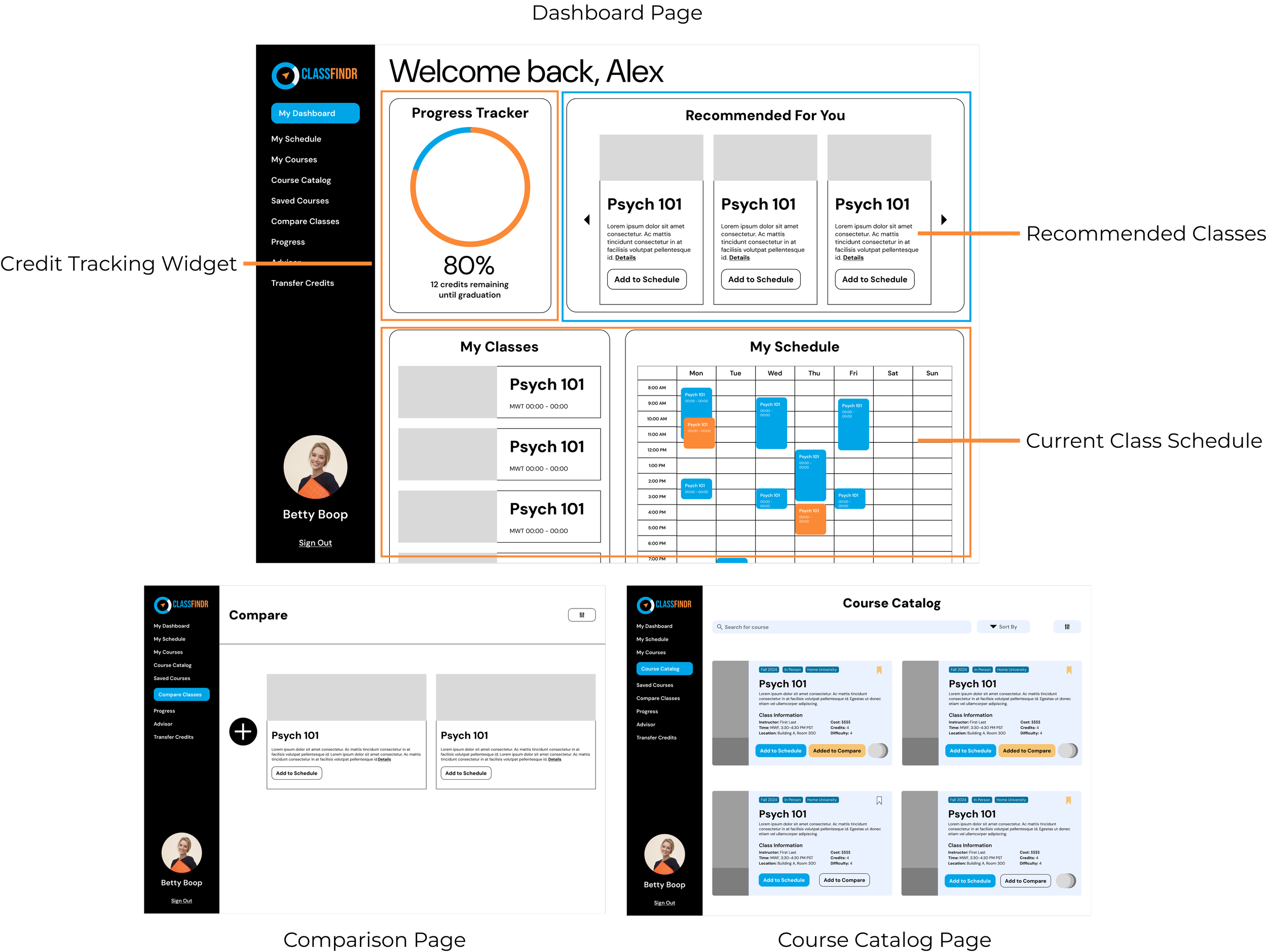
Our user flow guides students from the dashboard to explore courses, compare options, and add selections to their schedules. Initial sketches led to a mid-fidelity prototype.
Dashboard includes:
A credit tracker widget
A recommendations widget for suggested courses based on previous credits and advisor recommendations
A current schedule for easy reference
Course Catalog allows users to search and filter courses, add them to a hypothetical schedule, or compare them side-by-side.
Schedule Planner displays registered and prospective courses, with color-coding for clarity.
Usability Testing and Refinements
With our mid-fidelity prototype complete, we conducted five usability tests focusing on dashboard navigation, schedule location, class comparison, and filtering.
Key Findings and Adjustments
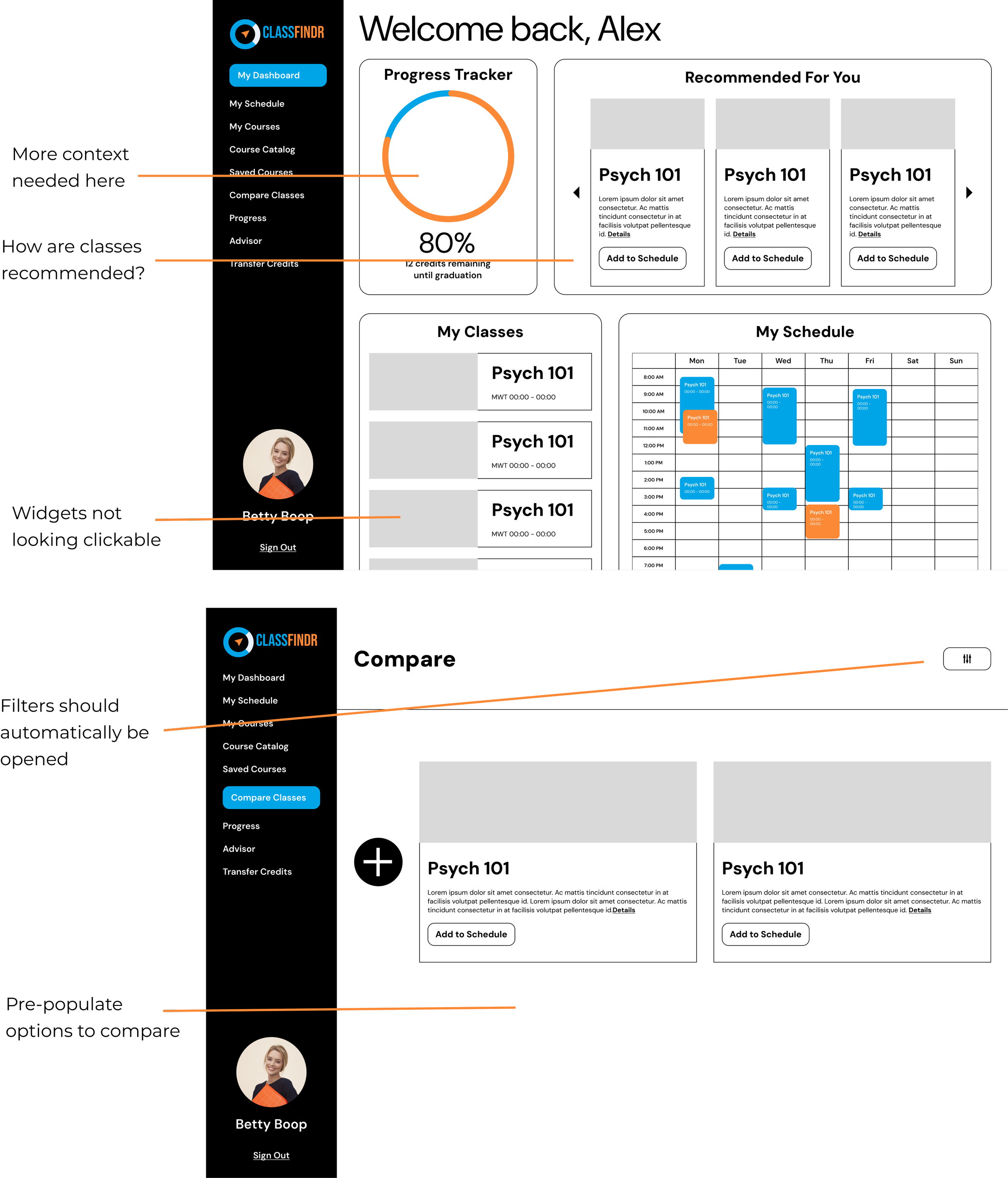
Progress Tracker: Users found it unclear, so we added additional context.
Recommendation Source: Users wanted transparency on recommendations (e.g., advisor vs. algorithm), so we provided more details.
Widget Clickability: Added “see more” buttons for widgets that link to full pages.
Course Comparison Feedback: We added a call-to-action for adding classes to the comparison page and pre-populated filters for convenience.
Clickable Schedule Slots: Users expressed a desire to search classes by time directly from the schedule view.
Visual Design and Final Prototype
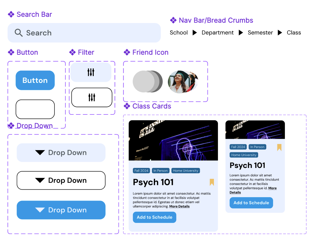
Our final prototype integrated a cohesive visual system:
Color Palette: A balanced mix of primary and secondary tones for readability and user guidance
Typography: DM Sans for headers and subheads
Grid System: Organized structure to support intuitive navigation
Component System: For uniform design amongst the team and pages.
Final User Flow: Betty’s Scenario
To illustrate our design’s usability, we demonstrated Betty’s journey:
Dashboard: Betty checks her credit progress and navigates to her schedule.
Schedule Planner: Sees an open time slot on Tuesday and searches for courses in the Course Catalog.
Filtering & Comparison: Betty filters by Child Development courses within her budget, adding suitable classes to the comparison page.
Decision: After comparing credits, time, and costs, she selects the course best for her needs and adds it to her schedule.


