Website Redesign
UX Design Case Study
Welcome to Fishs Eddy!
Fishs Eddy is a retail store known for its quirky and unique kitchenware. In this case study, I’ll walk you through the current website’s issues based on user testing, the improvements in navigation and information architecture, and finally, the redesigned mockups and prototype.
Current Site Evaluation
The initial steps were to understand the existing site through user testing, competitive analysis, and a heuristic evaluation.
Here’s what I discovered:
Let’s go on a Journey
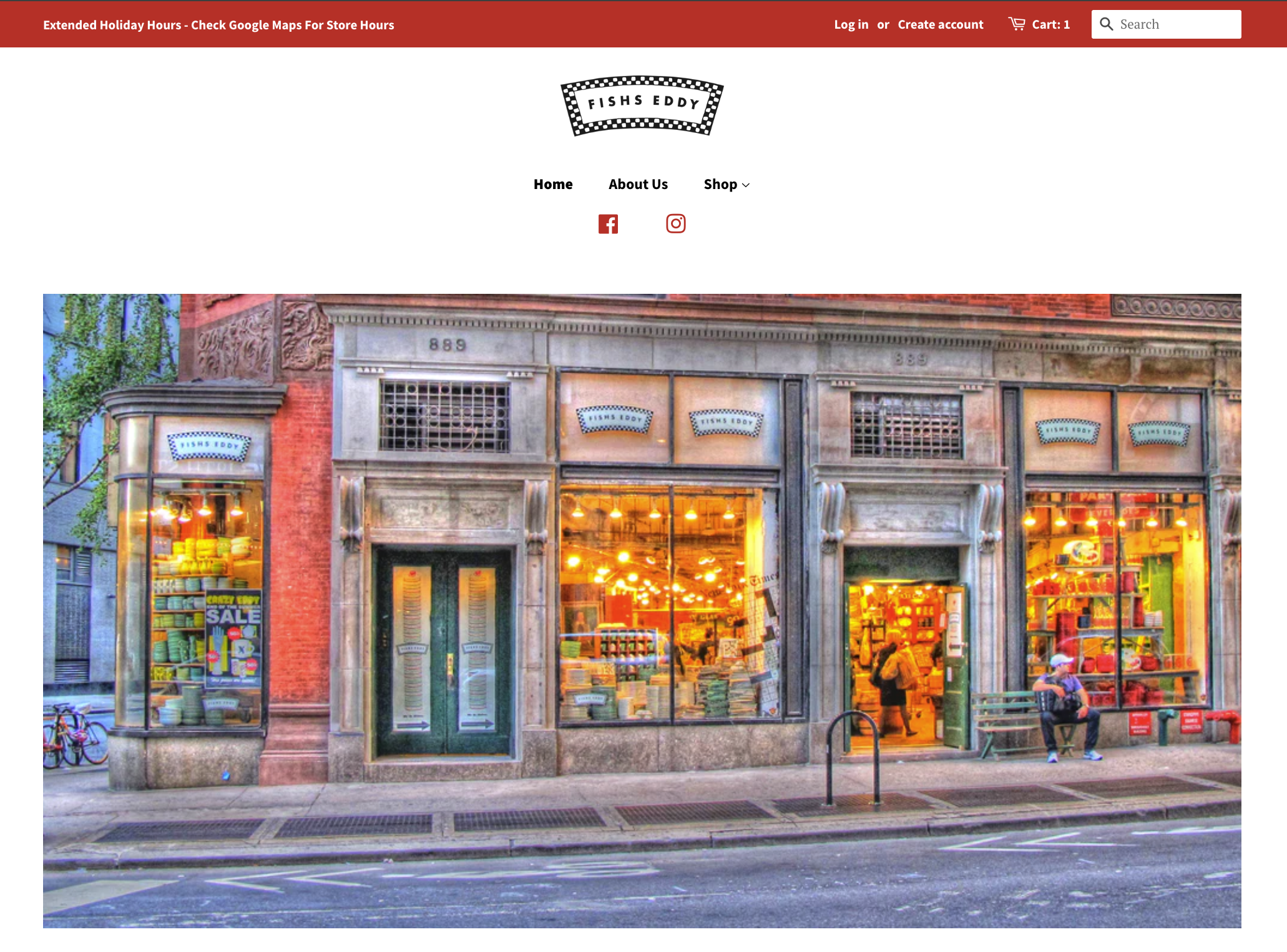
Homepage Experience:
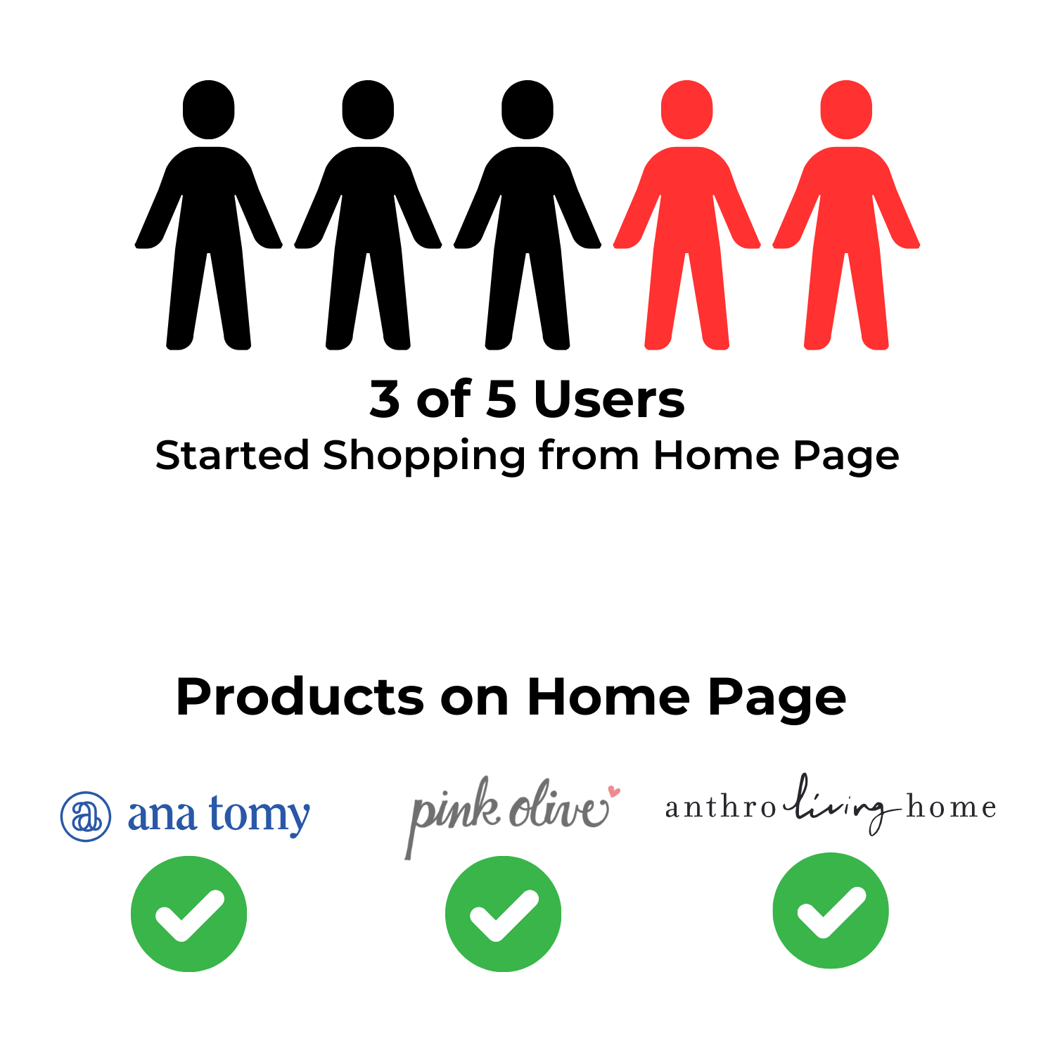
When users landed on the homepage, they were greeted with a picture of the storefront, which, while visually appealing but did not initiate the shopping process.
Out of the five users tested, three attempted to start shopping directly from the homepage but found no product listings or prompts. This frustrated users and even had some users confused about what they were even shopping for.
Competitors typically feature products or promotional content directly on the homepage to engage users immediately.
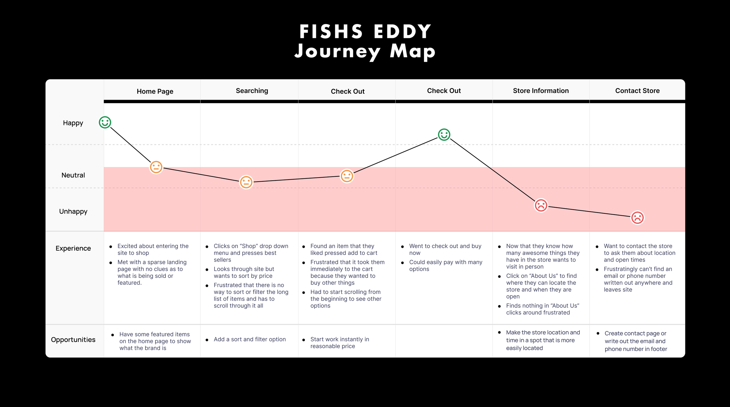
Shopping Experience:
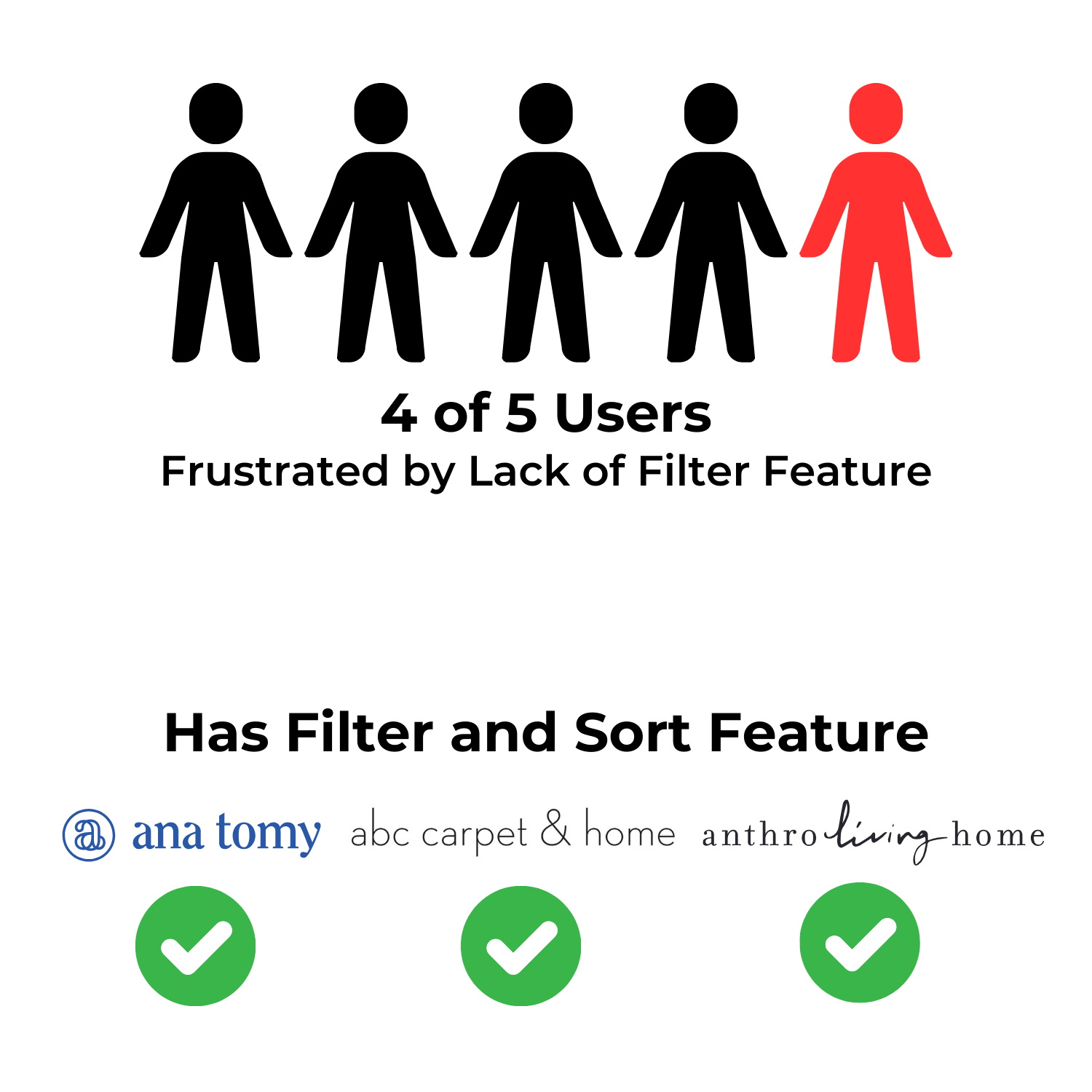
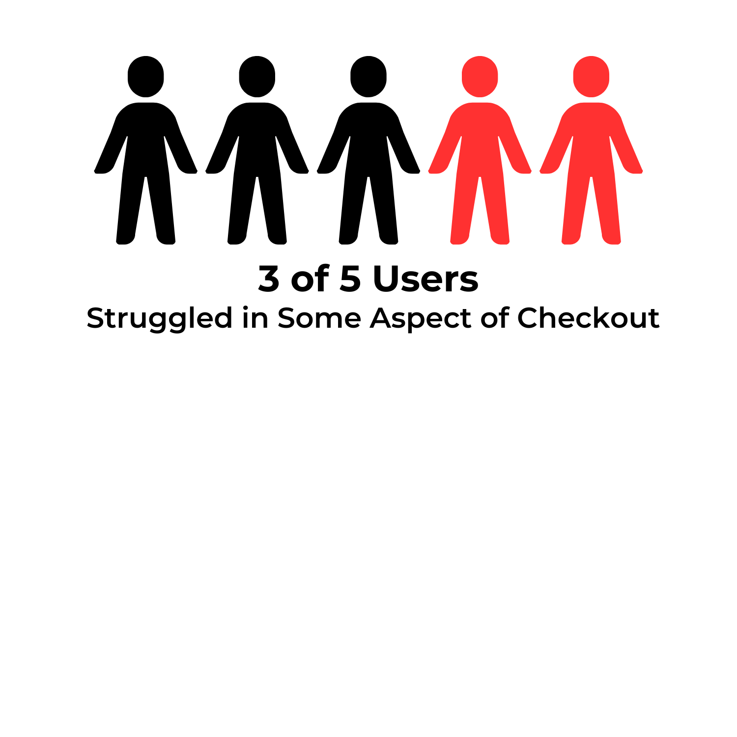
Users faced several hurdles while shopping. 4 out of 5 noted that there was no filter or sort functionality, commenting that this made the process of finding specific items tedious.
This is a standard feature on most e-commerce sites, and its absence was a notable pain point.
Checkout Process:
Adding an item to the cart redirected users straight to the checkout page, interrupting their shopping flow. Many wanted to continue browsing but found this immediate redirection disruptive. Additionally, removing items from the cart was not intuitive, causing further frustration. However, the actual purchase process was straightforward once users reached that point.
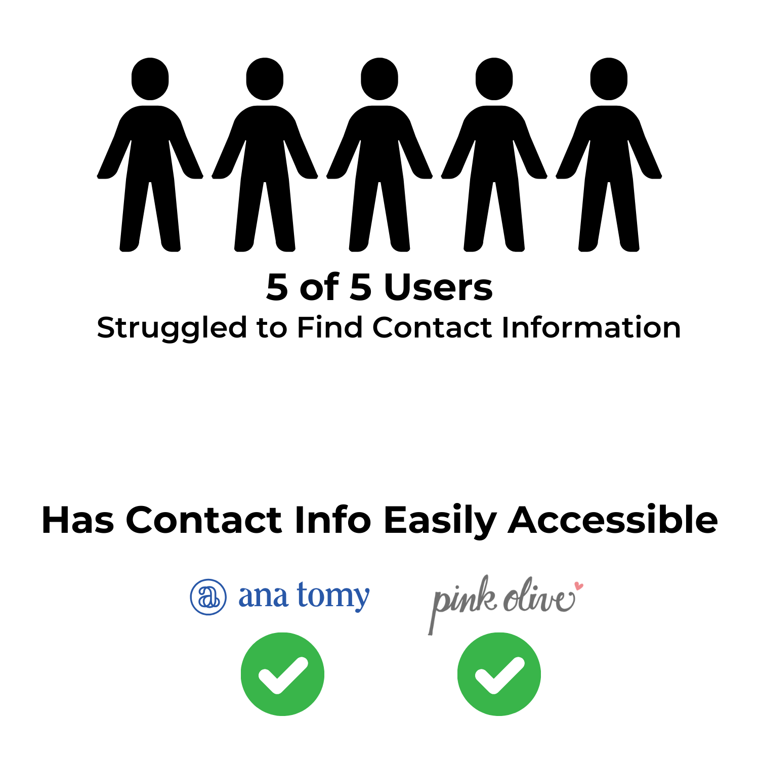
Contact and Store Information:
All 5 users struggled to find essential contact information, store hours, or location details. 2 users getting so frustrated that they gave up and never found this information.
This information was buried under a generalized “About Us” page, which mainly provided the store’s history. Competitors typically display this information prominently in the footer or a dedicated contact page.
Navigation Issues:
The site’s navigation had redundant links such as “About Us” appearing both in the global navigation and the footer, leading users to believe it contained critical information when it didn’t.
The footer also had confusing links like “Store Info” and “Visit in NYC” both leading to a contact form instead of providing actual store details.
Redesign Objectives
Improve User Engagement
Feature products or promotions on the homepage to entice users to start shopping right away.
Simplify Navigation
Streamline the navigation to reduce redundancy and ensure users can easily find contact information and store details.
Enhance Shopping Experience
Introduce filter and sort options, and make adding items to the cart less disruptive by providing a non-intrusive cart confirmation.
Maintain the Brand
Keep the store’s history available but separated from functional information and showcase the uniqueness of the store in the design of the site.
Let’s Start Designing
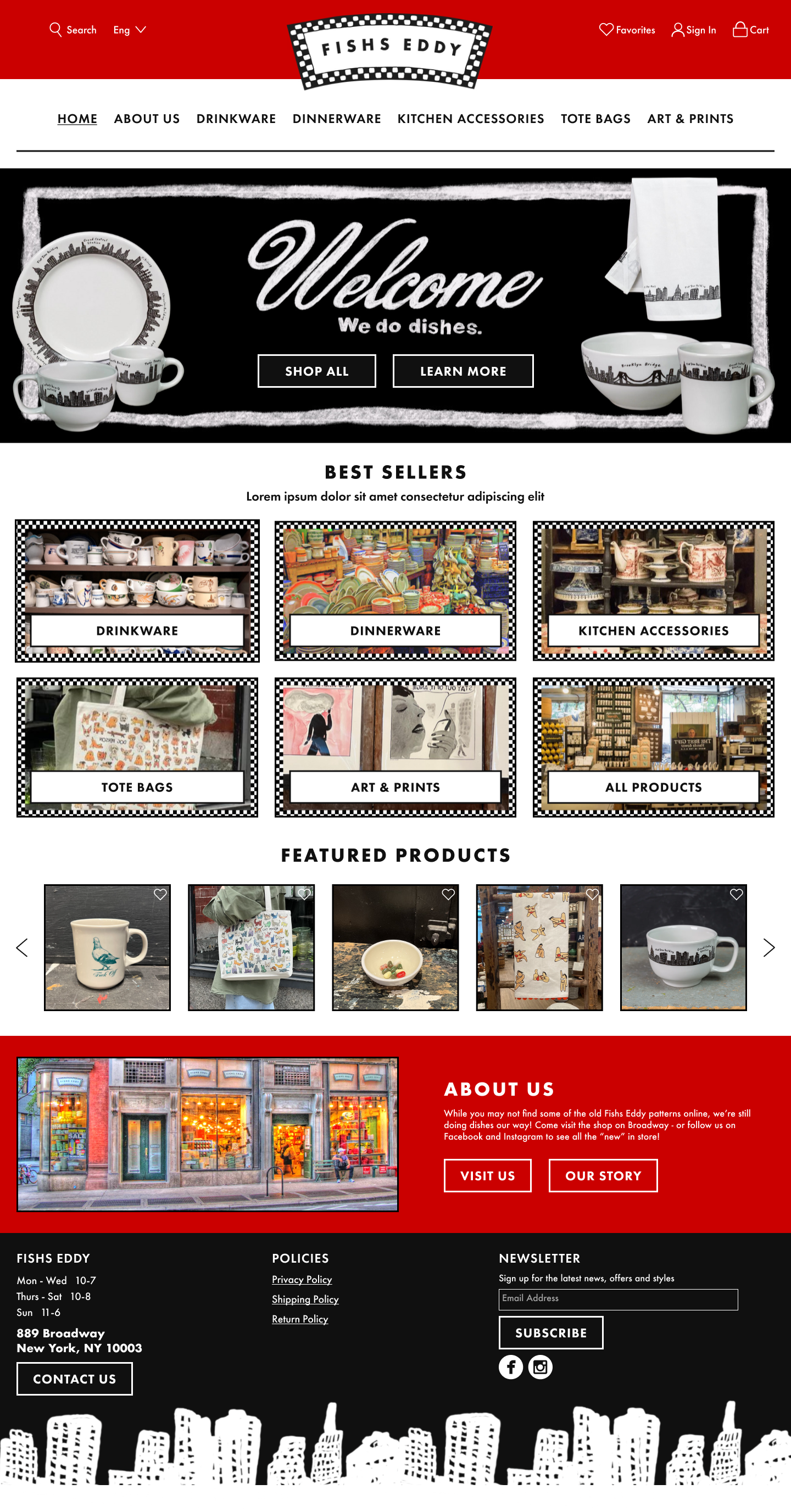
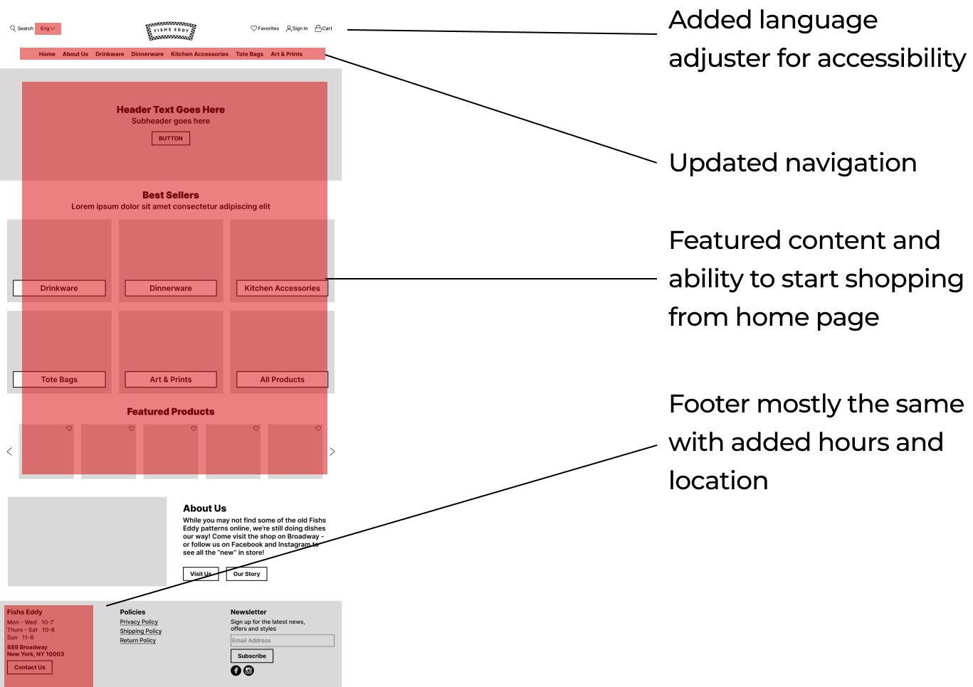
Home Page
The homepage now features a mix of product listings and best-seller highlights, inviting users to start shopping immediately.
Product Page
Added filter and sort options allow users the ability to browse effectively. Users can now like items and save them for later, as well as quickly add items to the cart without leaving the page with quick add options.
Adding an item to the cart now triggers a pop-up confirmation rather than redirecting users immediately to the checkout. This pop-up also features recommendations, encouraging continued shopping.
Product Details Page
Redesigned to include multiple product images, detailed descriptions, and a new review section. I also added a “Recently Viewed” section and suggested similar products to keep users engaged and shopping.


Bringing it to Life!
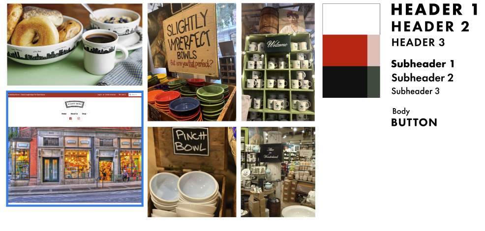
After developing the initial wireframe, I incorporated feedback to create a high-fidelity version. I used the font from their logo (Futura) and preserved the brand's colors and patterns to ensure consistency. I also integrated elements inspired by the store’s handwritten signs to bring its in-store charm to the digital space. My goal was to preserve the store's distinctive brand identity and showcase its unique character throughout the website.
Inspiration and Styles
Thank You!
This redesign aims to create a more user-friendly, engaging, and informative experience for Fishs Eddy customers, ultimately helping them shop more efficiently while still connecting with the brand’s unique story.